Newsletter Layout & Design/Local Lodges

Honorable Mention
Local 2559-Sky Harbor Flyer
Phoenix, Arizona
Editors: Melissa Campbell, Kelly Keely

The Sky Harbor Flyer has a strong nameplate that lets the reader immediately identify the publication and its purpose. It uses a clever combination of new and old style designs.

Honorable Mention
Local 1487-Air Waves
Des Plaines, Illinois
Editors: Kevin Curtis, Jane Wolski, Michael Callahan

The July 2000 cover makes use of large black type and a large grayed illustration to pull readers into the publication
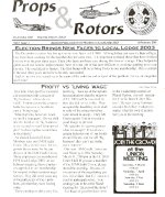

Honorable Mention
Local 2003-Props & Rotors
Daleville, Alabama
Editor: Patty Meek

Props & Rotors creates a lively rhythm with its two-page layout of union representatives (15 February, 2000 issue). Varying the placement of photos and type attracts the reader's eye to this spread


Third Place
Local Lodge 2330-IAM News and Views
Cambridge, Ontario
Editor: Alice Deighan

News and Views packs lots of copy into a flexible format-changing column widths-to vary the look of each page to ensure attractive and organized pages. Color rules are used to set off subheads. Small, colorful illustrations add interest


Second Place
W 157-Woodworkers Report
Enumclaw, Washington
Editors: Wayne Thompson, Cheri Focht

The Woodworkers Report has loads of individuality. Large, friendly typography with easy-to-follow articles. Ample white space between articles and large color headlines clearly show where one article stops and the other starts. Colorful illustrations add emphasis.

First Place
Local Lodge 733-Plant Chair Reporter
Wichita, Kansas
Editor: Jeff Kniep

Distinctive, well-organized style. Thick black and red rules set articles off from one another. Additional accent is gained through the use of side bar quotes and illustrations. Drop caps signal the start of each article.This newsletter communicates information with unity and style


Newsletter Layout & Design/Districts


Honorable Mention
District 70-F.Y.I.
Wichita, Kansas
Editors: Judy Pierce, Garland Moore

F.Y.I. deserves special notice for its use of numerous illustrations to appeal and attract readers.


Honorable Mention
District Lodge 837-Aerofacts 837
Hazelwood, Missouri
Editor: Bruce Darrough

Aero Facts 837's nameplate has style and strength. It works as a good visual symbol for this newsletter.


Third Place
District Lodge 190-The Sparkplug
Oakland, California
Editors: Debra Chaplan, Don Crosatto

The Sparkplug has a nice newsy feeling. It uses a formal design, but conveys a dynamic feel with many photos providing breathing space. It is an uncluttered publication that is easy to read. Judicious use of black bars with reverse type as subheads helps break up articles and keep the reader flowing through


Second Place
Lodge 725-The Aeronaut
Palmdale, California
Editor: Al Shaver

The Aeronaut handles space and layout in an imaginative four-column format that allows one column to be almost vacant. Along with generous margins, the display gives the publication a free, contemporary and open feeling.

First Place
District 143-District 143 News
Eagan, Minnesota
Editor: Mary Beth Christiansen

This magazine's visual design has a pleasant, light quality. Typography is presented in simple three-columns with ragged type, avoiding monotonous patterns and contributing to an attractive look. Numerous color photos attract the readers eye and keep interest high.


 Back